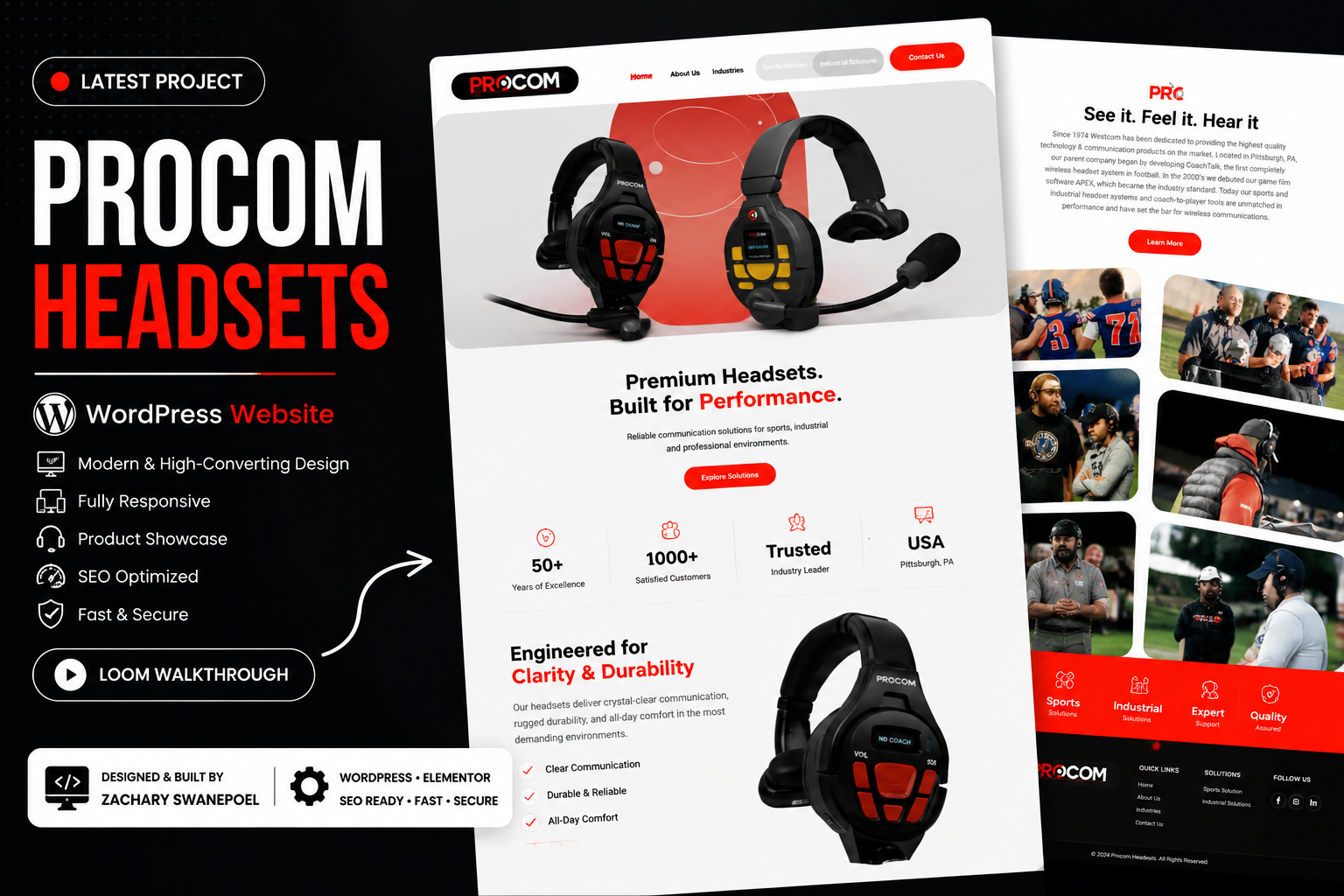
The brief
An existing design can contain useful content and structure while still feeling visually heavy. The Procom redesign work focused on refining the interface and moving toward a clearer, lighter visual system.
How I approach the project
Evaluate the existing visual direction
Start with what needs to be communicated, then review the hierarchy, contrast and density of the existing dark design. The goal is to change the presentation without losing clarity.
Create a cleaner visual language
The redesign explores brighter surfaces, more deliberate typography and spacing, and a consistent system for presenting the website's content.
Make the design work in the browser
A redesign is more than one visual frame. The linked walkthrough shows the project and makes it possible to review the presentation in context.
What matters most
Changing colours is easy; establishing a coherent visual hierarchy that survives real content is the more valuable part of a redesign.